
Overview
Reworld is a game creation software that provides users with tools to facilitate the game development process. As a UI Design Intern, I worked closely with game development teams to produce HUDs (heads-up displays) that fit the needs of different gameplay styles with a focus on mobile. One of the projects was a racing game where players collect coins and drive into obstacles/other players.
audience
Projects made in the Reworld Engine are often created with children 6-10 years old in mind. It is important to balance engagement and accessibility when designing for this group.
Research
Many children are familiar with mobile games and the controls of those games. It was important to study existing racing games on the mobile market to become informed on features and typically button layouts that potential players may be accustomed to before sketching concepts. Non-mobile racing games (console/computer) were also considered as some players may not have experience on mobile.
design & Iteration

The first version of the HUD took after the instructions of game designers on the team. At this point in development, it was decided that all cars in this racing game would accelerate automatically. This meant there would be no acceleration buttons.
This version of the HUD was designed to open up space and facilitate steering to compensate for the lack of control that arose from making acceleration automatic.
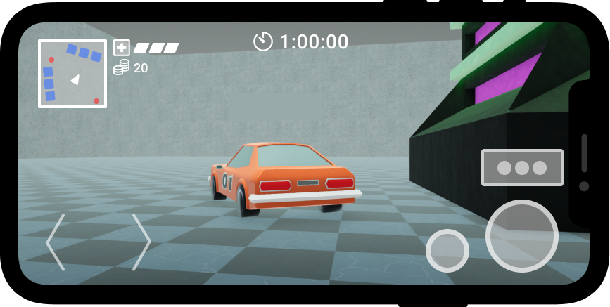
After playtesting and user feedback, game designers decided to implement controls for moving forwards and backwards. Changes to the HUD UI reflect these development changes.
Steering buttons were shifted to the bottom left to make room for new controls on the bottom right, which matches the placement of layouts on other mobile and even non-mobile racing games. The button for traps (imagine Mario Kart power-ups) was turned into a popup that only appears on screen when a player has obtained an item. Health and coin information was shifted towards the mini-map so players could view their status and the location of nearby opponents in one place.
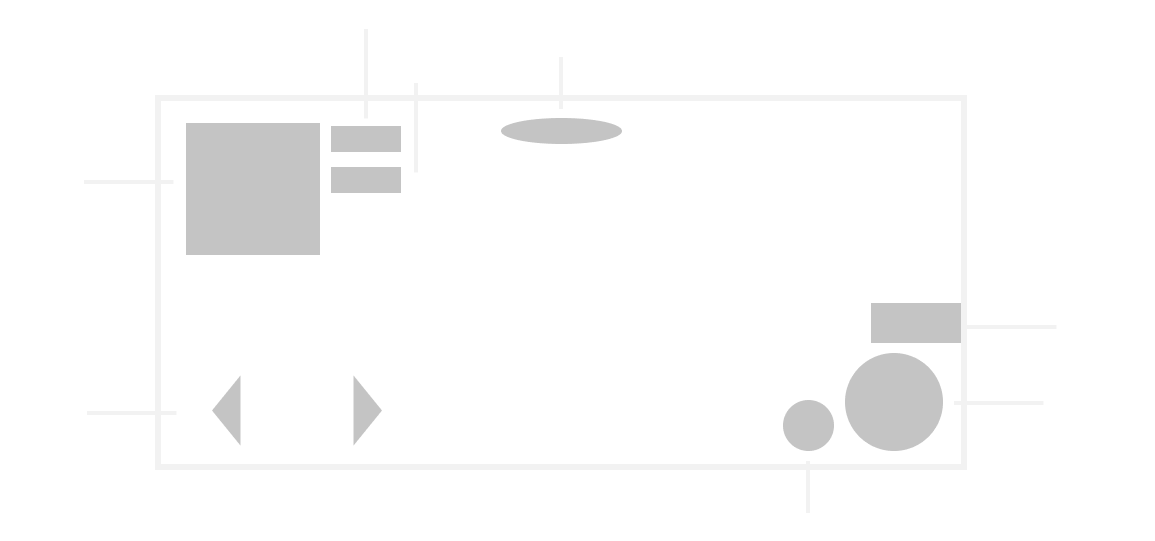
This mockup is a higher fidelity version of the HUD to determine the size and shape of UI elements before committing to a certain style.

The final iteration of the HUD features icons stylized to follow the neon/vaporwave aesthetic of the game. Using outlines rather than solid shapes both solidified the style and helped maximize screen space. Colors were also assigned to categorize what could or could not be pressed. All interactable buttons are blue and all non-interactable elements are pink, except for coins. Coins are yellow to represent gold as well as stand out. The goal of the game is to collect as many coins as possible, so it important for it to stand out so that players can easily track their progress.
Reflection
Working as a UI designer on a video game project has given me a fresh perspective on the design process. UI for an action game needs to constantly update the player on their status and surroundings, but also should not overwhelm them. An example of this balance is the trap button. Traps are a key part of gameplay, so it is important to have a big button to inform players of what trap they have and make it easy to press. in order to not take up constant space on screen, if the player has no traps, there is no button or outline. This allows players to see better and focus on collecting coins until prompted.