
Overview
During my time at Cox Automotive, I was part of the UX team and worked on the Autotrader and Kelley Blue Book (KBB) sites. As a designer, I performed heuristic analyses and designed solutions that can be experienced on the live sites, prepared interviews and studied user feedback, researched competitors and relevant products, and helped set the UX foundations for new features in development.
The most exciting project I had the opportunity to design for was the Kelley Blue Book Owner's Dashboard.

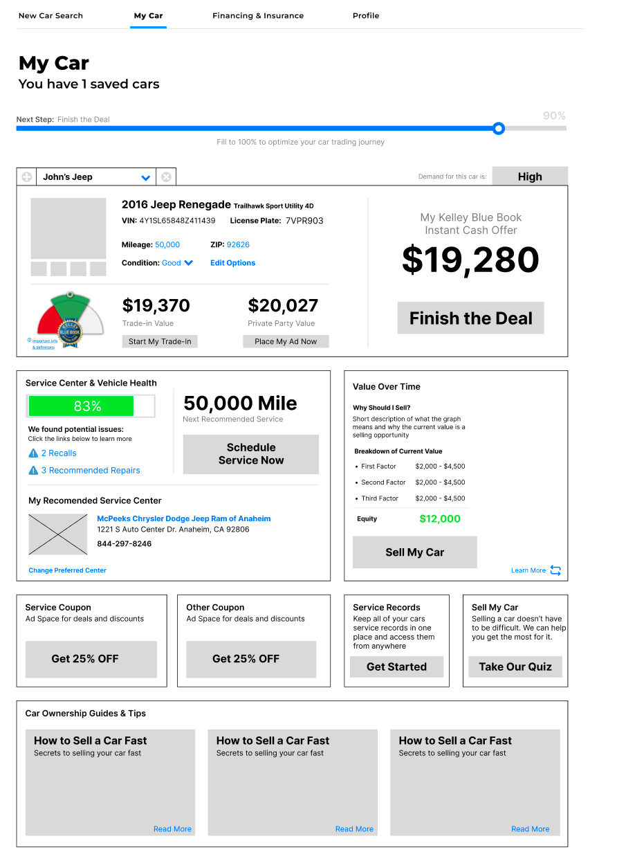
KBB Owner's dashboard
The goal of this project was to create a personalized hub for car owners that enables them to see a high level overview of their car information and provides them guidance for potential next steps. Since our objective was to streamline the process of car trading and reduce the stress of users, gamification and minimalism of the car trading process was a priority in this design process.
Research
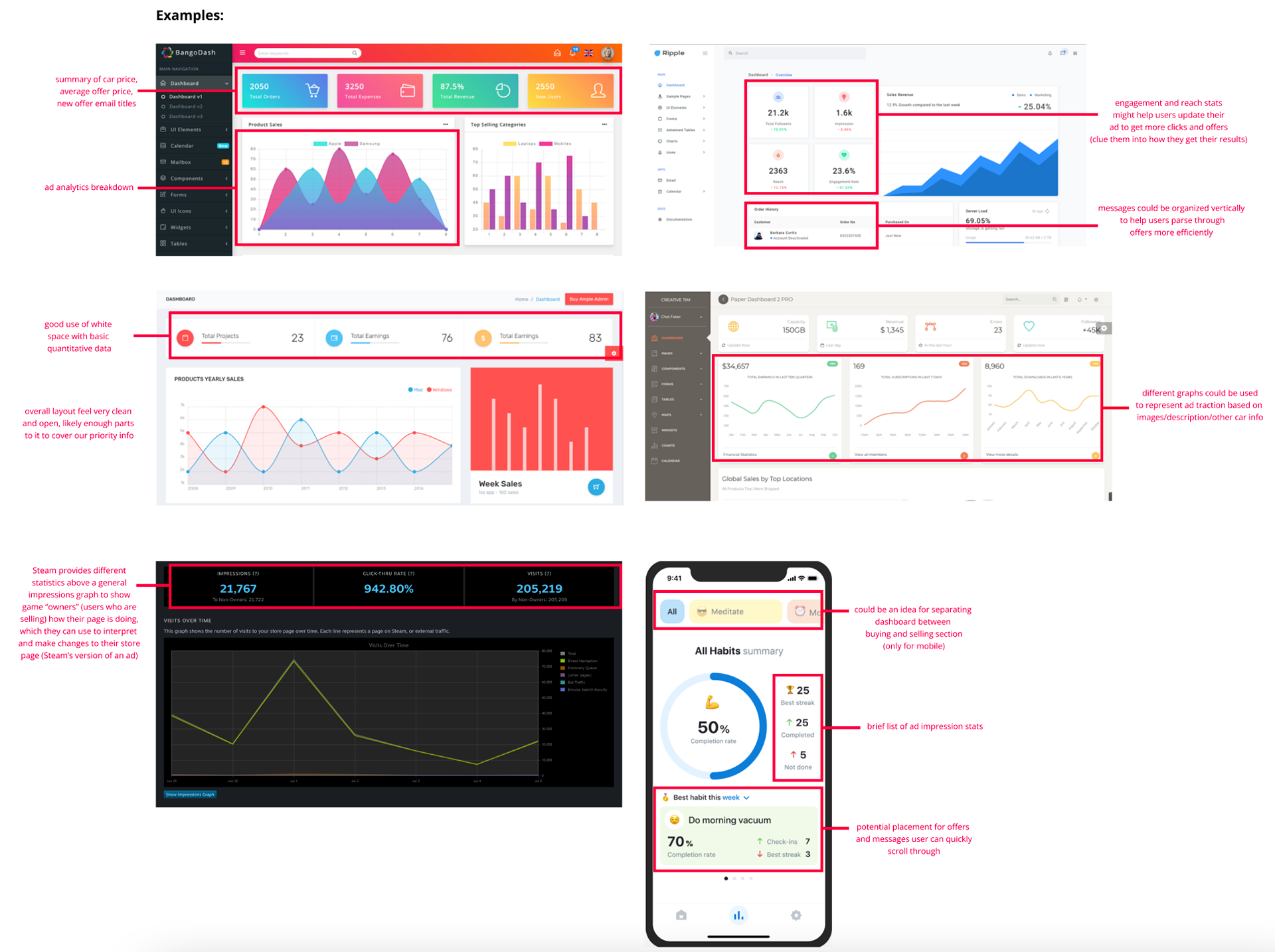
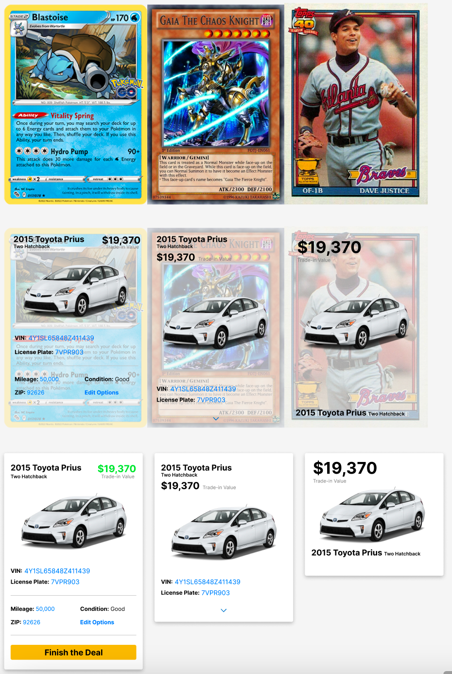
Research involved studying up to date dashboard design conventions, analyzing layouts from competitors/relevant products, and studying user feedback across KBB as a whole to create a prototype. Since our goal was to streamline a stressful task through gamification, I looked to dashboards in non-automotive industries such as gaming and finance in products like Steam's game developer platform and SoFi's brokerage app. I also looked into ways of displaying car information in an engaging and intuitive way, which brought me to the study of trading card designs from Pokémon, Yu-Gi-Oh!, and Baseball.
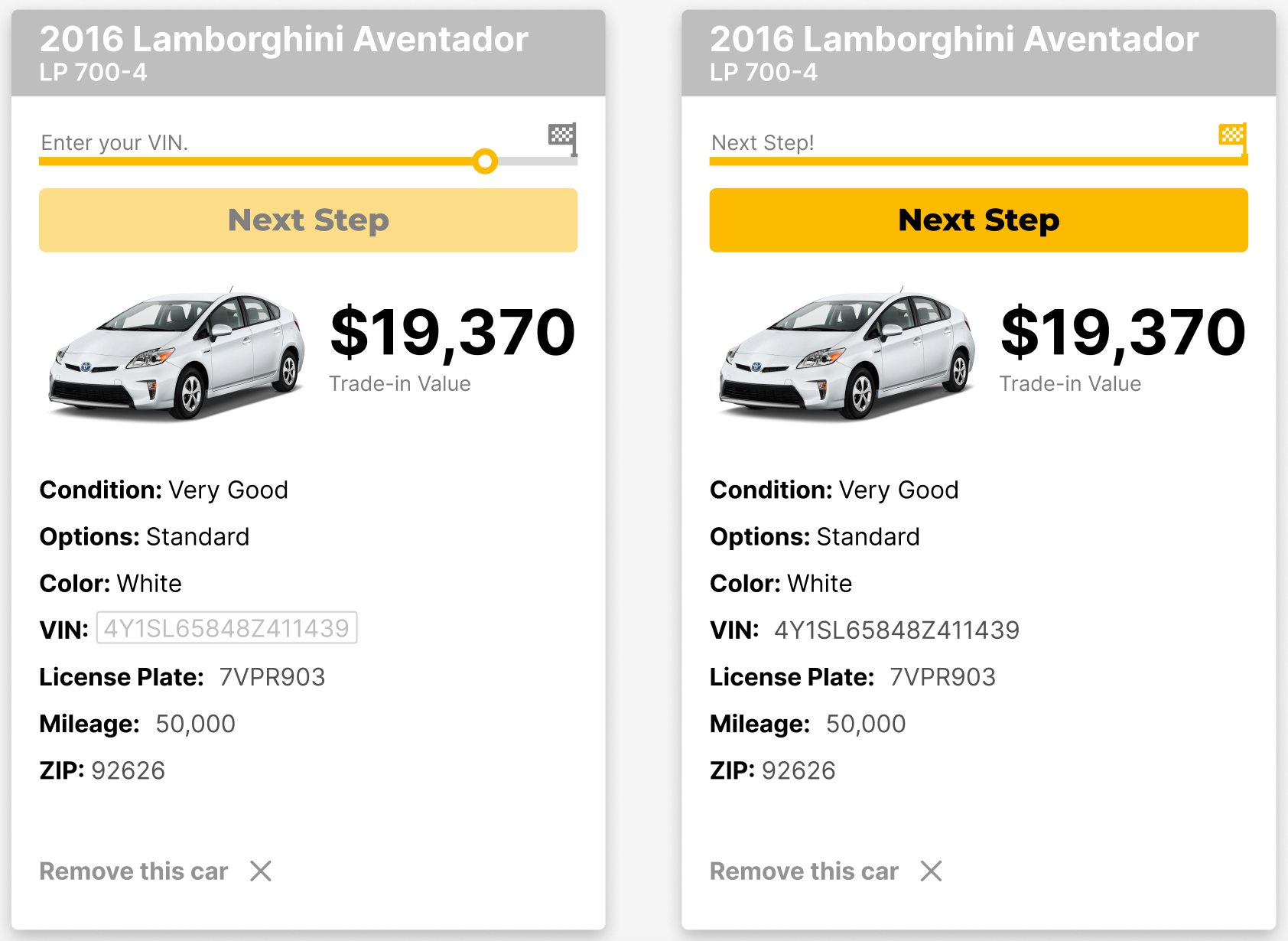
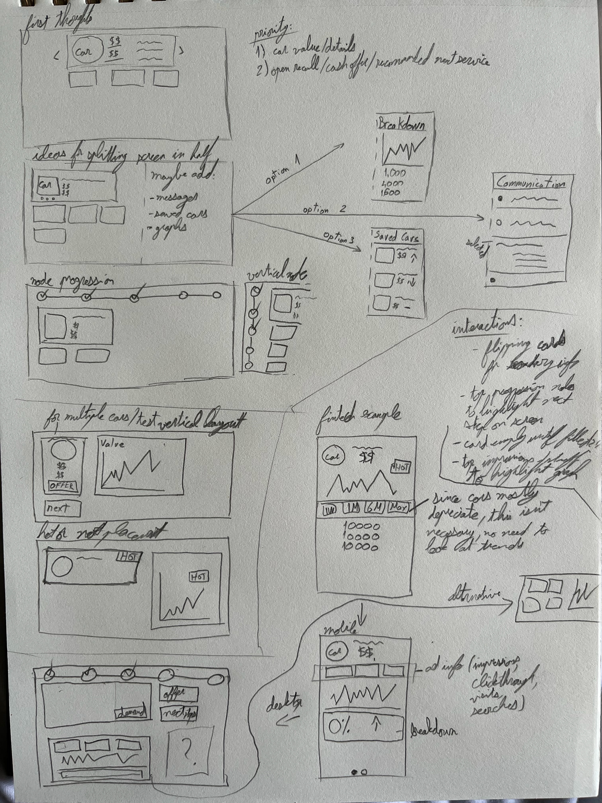
Sketching
Sketched various dashboard layouts based on user flows created by Senior Designers. Worked with other designers to come up with visualizations that would best benefit users in the process of trading their car(s). Interactive line charts and status icons were some ideas that fit our need for legible visualization and dashboard gamification. Another idea was separating elements into cards that can be flipped, which allowed the dashboard to remain minimal while also storing extra information without navigating users to an entirely new page.
Mocks
Created low fidelity mocks to get a more refined look at the amount of space each element should take up on screen. Iterated on the design with feedback from Senior Designers to appropriately organize elements and include information required by the Business team. One of the greatest challenges was balancing minimalism with the sheer amount of information that needs to be easily visible and accessible.
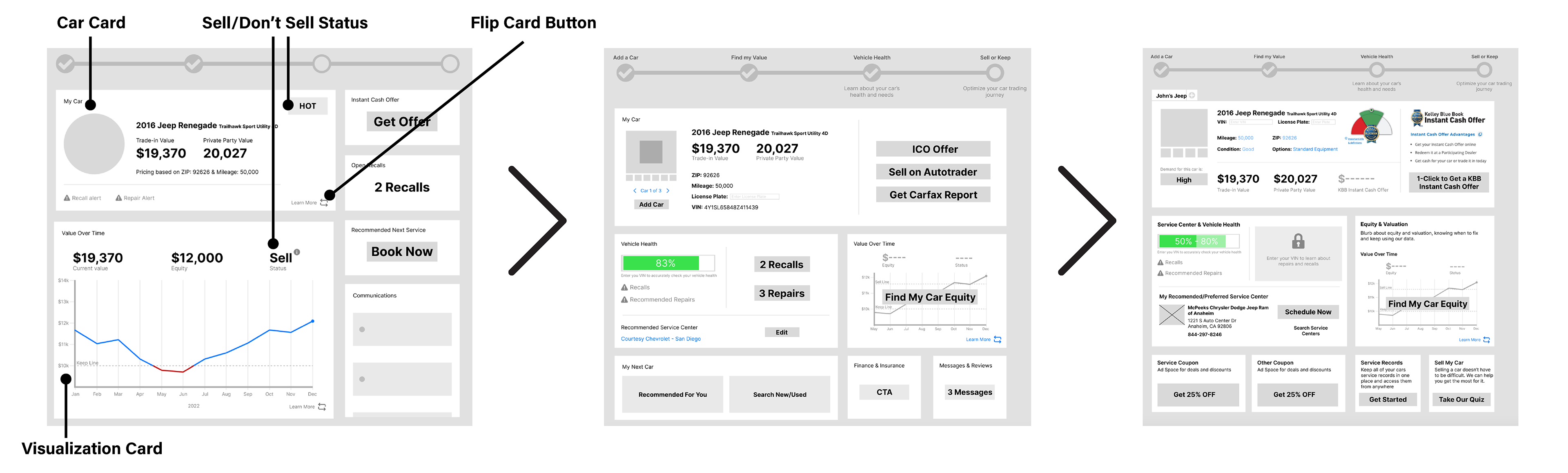
Final Prototype
The final mock was approved by the UX and Business teams to move beyond "Discovery" and into the "Design & Delivery" stage.